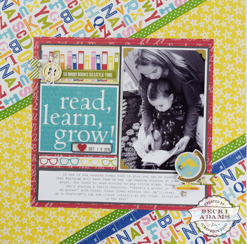
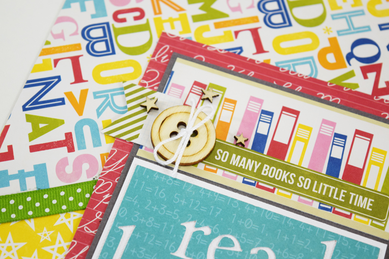
Hi friends, Becki here, with another edition of Inspiration Station. This is my favorite week of the month because I love sharing process videos with you. Today, I created a layout using the Jillibean Soup Alphabet II collection (a school-themed collection).
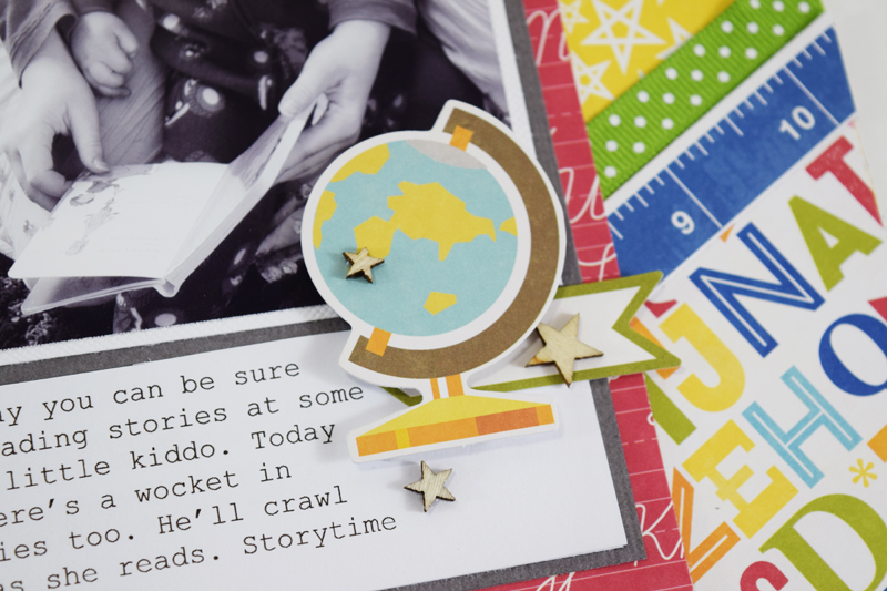
Although the photo I chose to use with this collection isn’t a school-themed photo, it’s a photo about reading which works well with a school-themed collection. I chose to print my photo in black and white. The colors of the photo are a little off because I took the photo in the evening light in my living room. Tip: when the color of a photo is a imperfect, try printing in black and white. Often a less-than-perfect photo will look great when printed in black and white. I think you’ll enjoy watching this layout come together.
I created the center portion of my layout using a title that I created with my Silhouette Cameo. I love being able to make custom titles for any of my projects. I chose to make the title, “Read, Learn, Grow” using THIS cut file from the Silhouette Design Store.
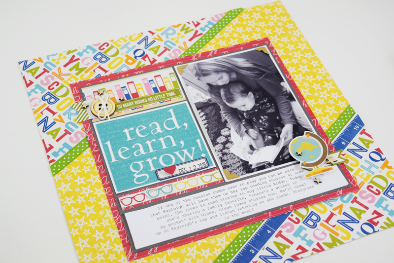
Because this layout features so many busy patterns I kept my embellishments to a minimum.
I added a few wood veneer pieces, some stickers, and a couple of die cuts. Each element added a bit of texture and some of them also added a little bit of dimension.
I used a liquid adhesive to adhere the wood veneer. I put my liquid adhesive onto the paper instead of on the tiny wood veneer pieces. This is easier for me than putting adhesive on the tiny pieces of wood veneer.
I love how this layout came together. I love the bright eye-catching colors mixed with a black and white photo. The black and white photo really pops off the page against the bright colors.
Thanks for stopping by the Weekly Scrapper blog this week and I hope you enjoyed the video. I’ll see you next Thursday!
