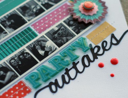
I spotted this fun layout on the Scrapbook & Cards Today blog and just knew I had to share it. When was the last time you got 35 pics on a layout? Wow! I’d like to thank the very talented Lisa Dickinson for sharing her adorable layout.
To create this fun and whimsical look, Lisa printed the photos in horizontal strips, sizing each photo to approximately 1 x 1.” The paper collection Lisa used is the RSVP collection from Basic Grey, but you can use whatever you happen to have in your scrap stash.
There are no rules; if it makes you smile, then it’s ok! Mix and match your collections, break out your favorite washi tapes, and just relax and have fun with it.
I love how Lisa added two circular shapes at the top and bottom of the design. They really help soften all the straight lines while guiding the eye through the layout.
I know, now you want to run out and takes lots of photos and shrink them down to size. I know that’s what I’m going to do!
Thanks for stopping in for a visit and I hope you have a very creative day.
Supplies
- RSVP Paper Collection (Basic Grey bg-c-svp-4389 $17.49)
- RSVP Stiched Vellum Stickers (Basic Grey bg-svp-4399 $4.00)
- RSVP Vellum Tape Stickers (Basic Grey bg-svp-4397 $4.00)
Supplies Used (Not Shown)
- Sentiments
- Colored Enamel Dots
- Sewing Machine
- Thread


