A fast and easy way to build a layout is to use a grid format. I like to create small little squares or rectangles that are the same size as my photos and then add embellishments to each section until the page looks complete!
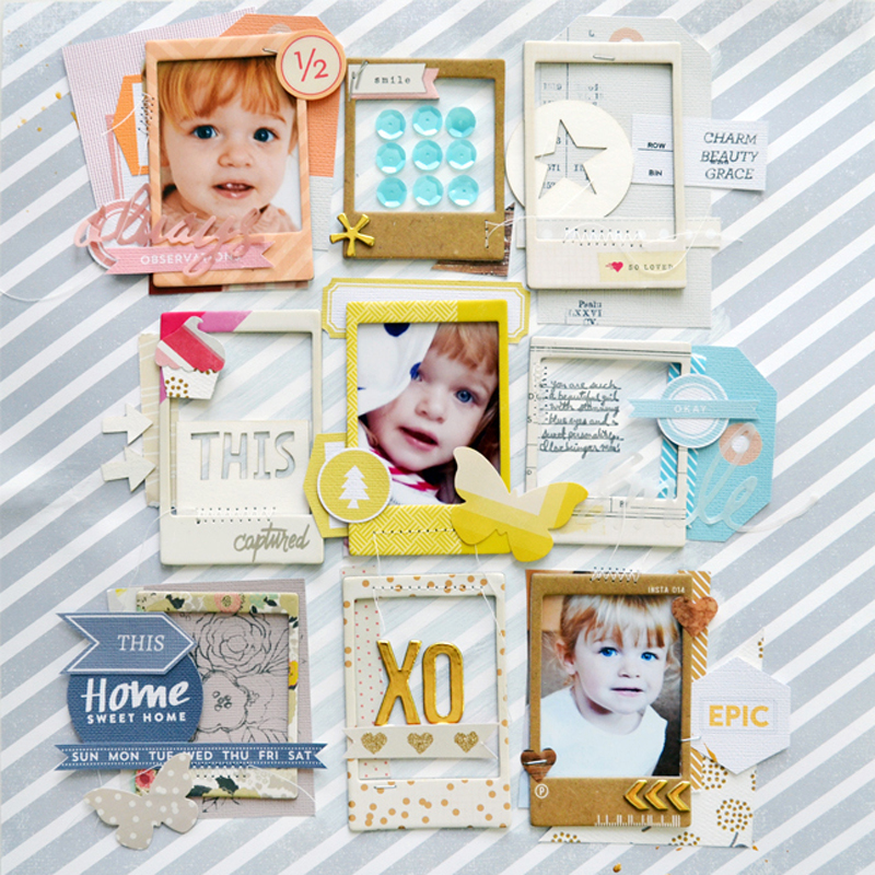
XO by Paige Evans
On this layout I made a 3 x 3 grid featuring chipboard frames that were so fun to fill with photos, die cuts, stamping, stickers, and more!
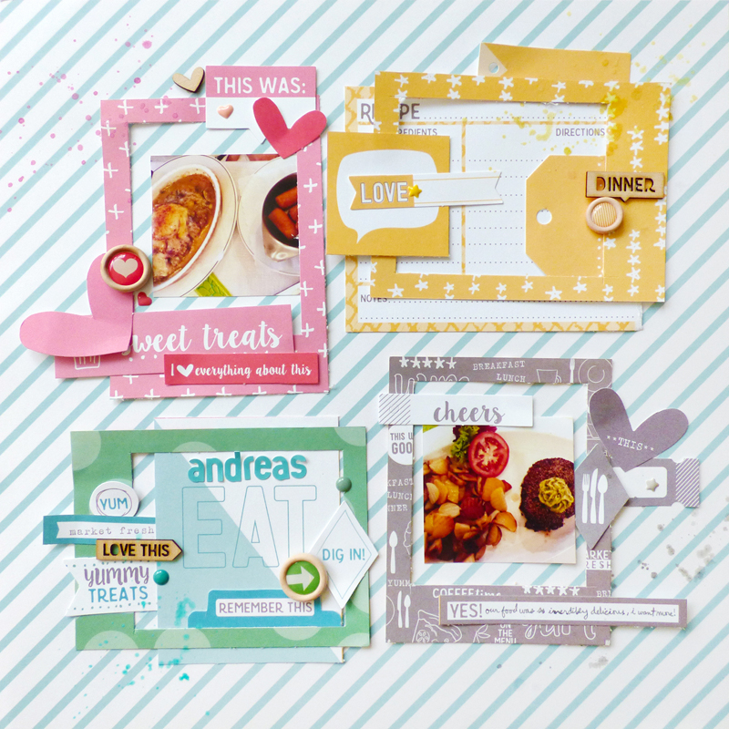
ANDREA’S RESTAURANT by Paige Evans
Here I made a 2 x 2 grid and used primarily four colors: pink, yellow, green, and gray. I used only that color inside that section to create fun textures and make a colorful, bold statement.
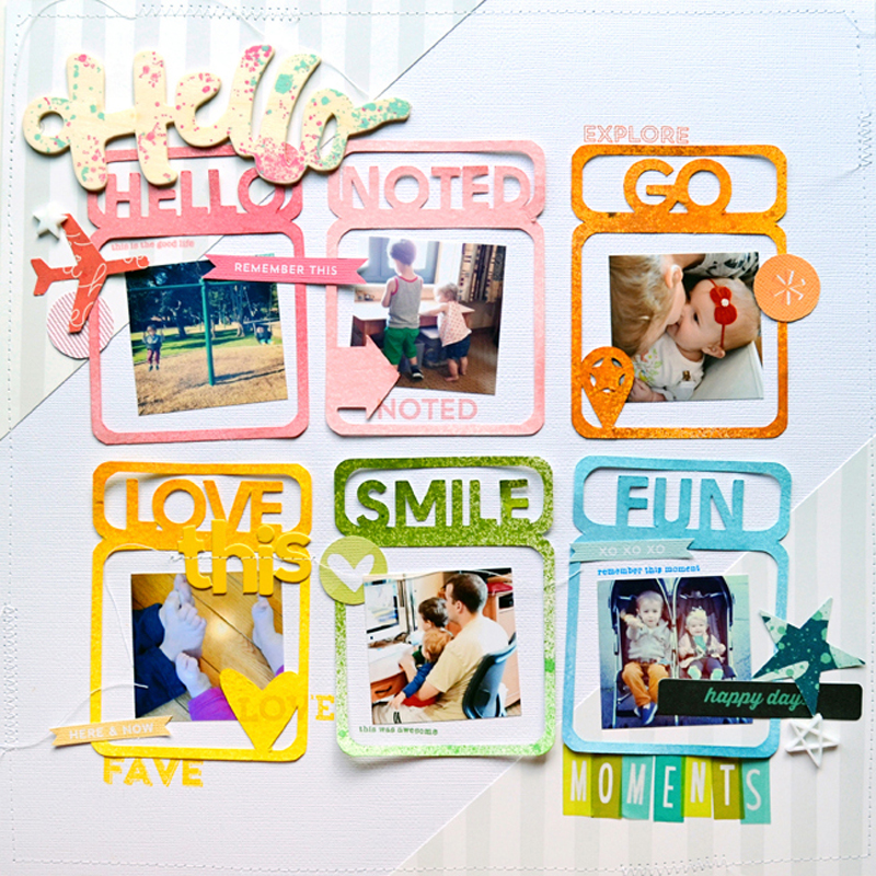
HELLO by Paige Evans
This page has a 3 x 2 grid made with die cut frames that I sprayed with mist. Again, I used the color-on-color technique to define the spaces.
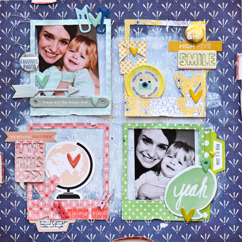
FAVORITE PHOTO by Paige Evans
Here is another 2 x 2 grid example. Since the background is so dark I lightened it up with some paint and then embellished on top.
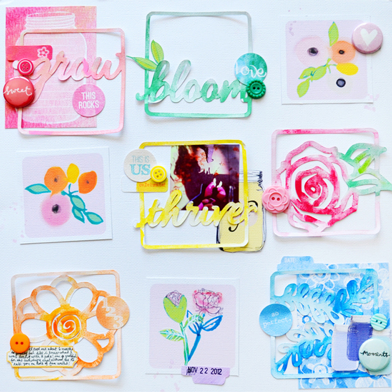
GROW by Paige Evans
This final example is a 3 x 3 grid made with intricate die cuts that I painted and sprayed for whimsy. A few embellishments like buttons, badges, and printables placed over the squares makes an eye-catching design. You can’t go wrong with grids!
