 Hello, my artsy friends, I hope that you are enjoying a beautiful and relaxing Sunday. Today’s article is all about those special boys in our lives and as usual, I have a delicious dinner picked out that is sure to be a hit with the family.
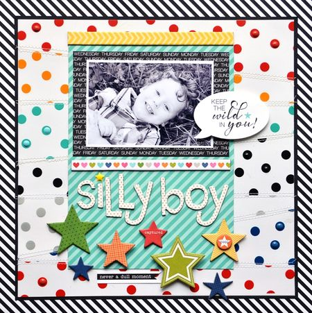
Silly Boy Layout Using Transparent Overlays by Jennifer Chapin
Have you played with the new Clear Cuts Transparency Overlays yet? Clear Cuts are 12 x 12″ transparency overlays that are available 14 colors, including metallic gold and silver. Clear Cuts are perfect for your mixed media projects, banners, scrapbooking layouts, cards, and let’s not leave out mini albums!
I know we’ve all created those 3-hour (or more) layouts, but how nice is it when you can offset things with a fast, easy and oh-so-cute layout. I love how Jennifer alternated strips of the Clear Cuts Transparencies in a slanted pattern, then adhered them to white cardstock and stitched the edges down. The priceless black and white photo really pops against all the bright, bold colors. If you have been as inspired as I was about this fun new collection, just click here and I will take you over to the Bella Blvd site so you can check out the rest of the collection. Make sure to visit Jennifer’s blog here for even more of her wonderful inspiration.
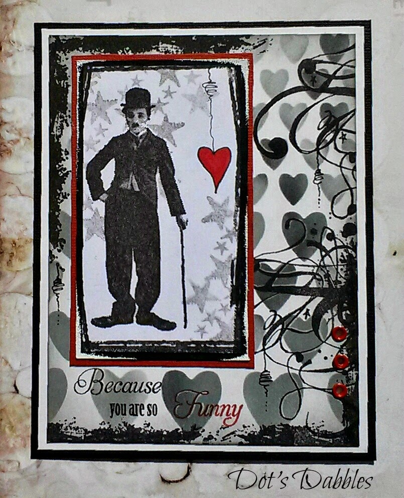
You Are Kinda Awesome By Anabelle O’Malley
I’ve been hearing that many of you would like to see more masculine projects, so I hope you enjoy this adorable card designed by the very talented Anabelle O’Malley. I highly recommend stopping by Emma’s Paperie for a nice long visit, you will definitely be inspired to start that next project.
Who wouldn’t feel awesome after receiving such a sweet handmade card like this? I love how Anabelle mixed things up by using several different Simple Stories and October Afternoon collections.
When designing a masculine-themed card you can never go wrong with a black and white pallet. I love how the red accents add a bit of drama to the card and the doodling adds a nice personal touch.
The hearts in the background were created using a stencil and experimenting with the amount of ink used. A little more ink here and there give the hearts an ombre effect. I hope that you’ve been inspired to give Dot’s technique a try.
Vintage-Look Crates @ It All Started With Paint
Ok, I admit this project can be unisex, but boys need storage too, right? This one is definitely on my crafting Bucket List. This crate is perfect to store just about anything. You can find these crates unfinished at most of your craft stores and with a little stain and some stencils the project comes together pretty easily.
The biggest question I can think of is how many are you going to make? They would be perfect in the kids room; I love how each crate has a name and EST with a year. Maybe if we personalize our childrens’ bins they will take ownership and be more proactive in cleaning their rooms. I know it’s a long shot, but worth a try! 😉
This is one of my husband’s favorite dinners, I hope you give it a try! I know I usually post dinners in under 30 minutes but this one is worth the extra 20 minutes.
All you have to do now is add a nice salad, a loaf of your favorite crusty bread and you’ll be in heaven! Click here and I will take you over to the Food Network Blog where you can print out Paula Deen’s recipe. Bon appétit!
Thanks for spending a bit of your Sunday with me and I hope you have a great week!


Super cute, super fun projects! Love that layout, so colourful!
Hello Kimberly, It makes me smile knowing that you are inspired by our posts. I do love that layout, have you given the Clear Cuts Transparencies a try? I just returned from our Scrapbook Expo in Anaheim and picked up a few. Happy scrappin, looking forward to seeing you back soon.