
Mixing and matching different fonts, colors, and styles of Thickers has been a long-time favorite technique of mine! I am going to show you a layout I made just recently as well as a page made all the way back in 2008, and layouts in between those years, that use this same concept but with different looks!
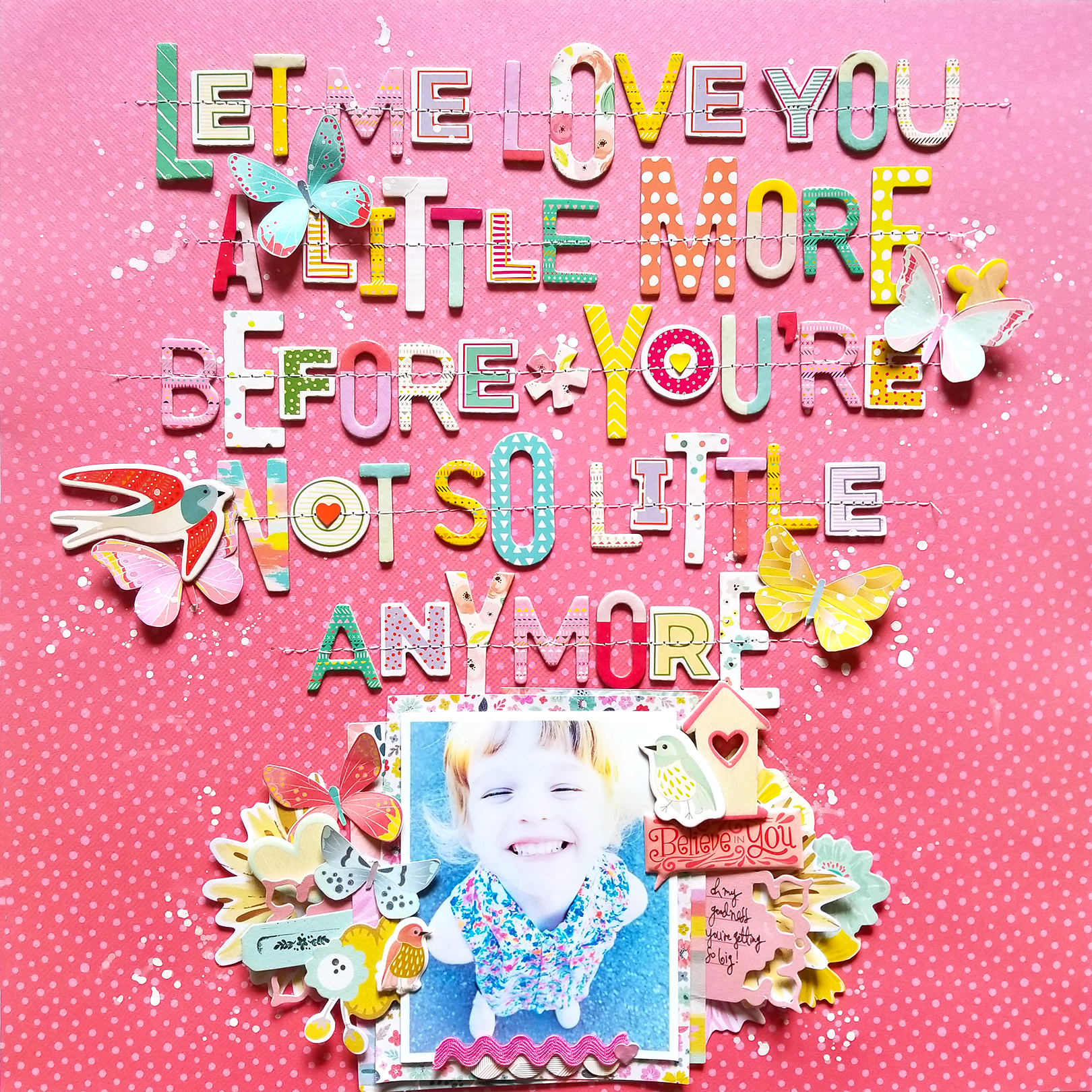
LET ME LOVE YOU by Paige Evans
This first layout mixes all of my Pink Paislee Thickers – so they’re from Fancy Free, Take Me Away, Oh My Heart, and Turn the Page. I love how all the different sizes and colors still look cohesive!
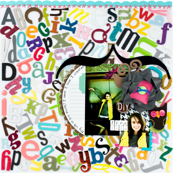
LIVE LIFE by Paige Evans
This is the layout that I made back in 2008 when I worked in house at American Crafts as a scrapbooker! Dream job I tell ya 🙂 Anyway I was asked to create a page featuring Thickers so I went through every box of Thickers they currently made and picked and pulled alphas to create this fun and unique background. It’s a great way to use those letters you hardly use!
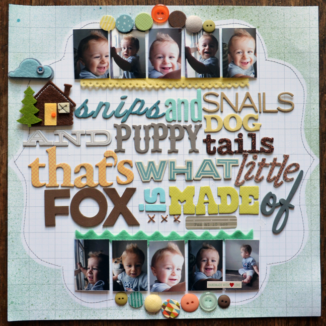
SNIPS & SNAILS by Paige Evans
I love this saying and making long titles with different Thickers. I like to sketch the placement first and then lightly place the letters on the page, make sure of the placement, and then push/adhere them down.
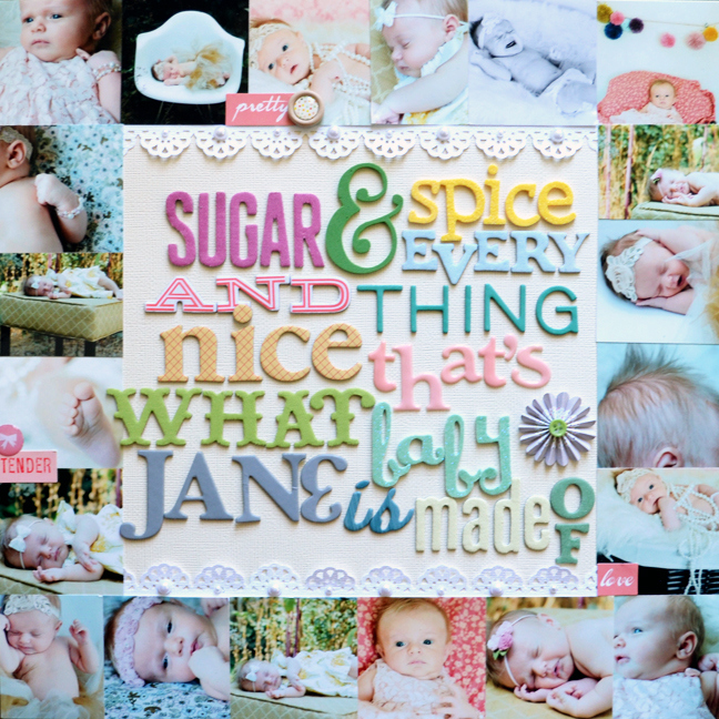
SUGAR & SPICE
Well since I made a page for my son I had to make a similar one for my daughter! A different technique I used here besides the mixing and matching of Thickers is to create an entire frame of photos! I couldn’t possibly narrow down any more the photos I wanted to feature so I shrunk them down to a little size and made a border out of them.
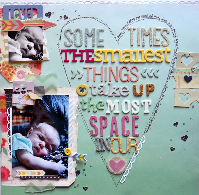
THE SMALLEST THINGS by Paige Evans
Here is a final example of mixing and matching Thickers to create a fun and colorful and whimsical title. I hope you are inspired to give this technique a try! Goodness knows at one point I had more Thickers than I could even count!!
I love all of these pages. Very clever using all the mixed alphabet letters to make your title. Each one is so unique and pretty. I must scrap lift one of them in the near future. Thanks for sharing.
Beautiful layouts! A great way to use up all those letters when you don’t have all the matching letters for a whole title!
like this idea very much , thank you . i have many dies that are diffrent fonts wow I’m going to be busy lol.
Absolutely the most colorful, beautiful work from a very talented Lady!!
Absolutely so beautiful & colorful by a very talented Lady!!