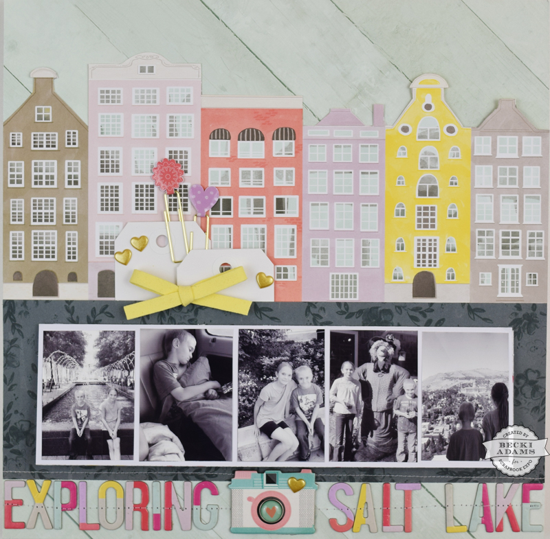
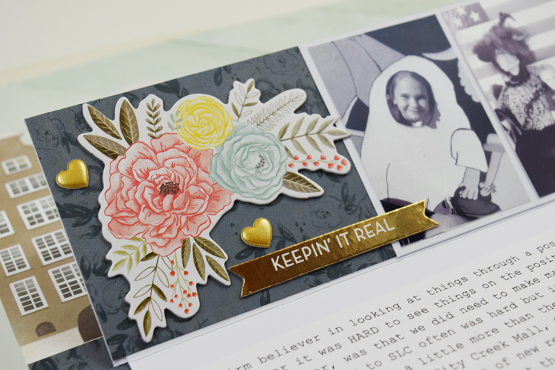
 Hey friends, Becki here, for another edition of Inspiration Station. Today I have an interactive layout with a video tutorial to share with you. I’ve had the Take Me Away collection by our very own Paige Evans and Pink Paislee sitting on my desk, untouched, for way too long. I decided that it was time to create something with this beautiful collection.
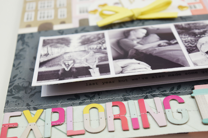
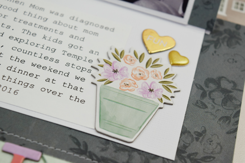
I had eight photos and a long paragraph of journaling that I wanted to fit on this layout. There was quite a bit that I wanted to say about these photos and while it’s not really personal, I didn’t want the journaling to be the main focus on this layout. I decided to hide the journaling under the photos by creating a flap out of white cardstock. I also added a few more photos under the flap. (You can see exactly how this came together in the video.)
Along with the hidden photos and hidden journaling, I added a few embellishments under the flap as well. I create interactive layouts quite often. The question I have most frequently asked is “how do you see what’s under the flap when you put the layout in a page protector?” Well, I show you exactly how to solve this problem in the video.
I love how this entire project came together. Not only is it a beautiful layout, it tells an important story.
Do you have an important story with a lot of journaling and a lot of photos? An interactive layout is a great way to get those important stories into your albums. Thanks for stopping by the Weekly Scrapper blog. I’ll see you again soon! Have a happy and safe Halloween!
