
Hey everyone! Roree here with today’s Inspiration Station post and I have a beautiful project and some fun products to share with you from our new brand, Keep It Simple.
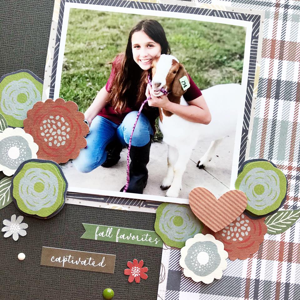
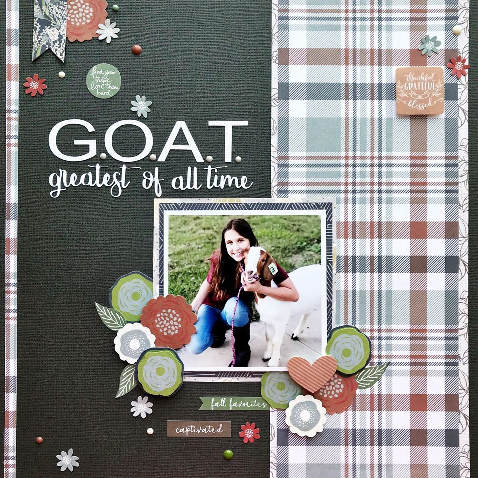
Today, I am sharing the work of Heather Leopard, an amazingly talented designer who worked with the Farmhouse Fall collection. Here is a layout she created using this gorgeous line:
She created her layout base with cardstock and papers from the Collection Pack.
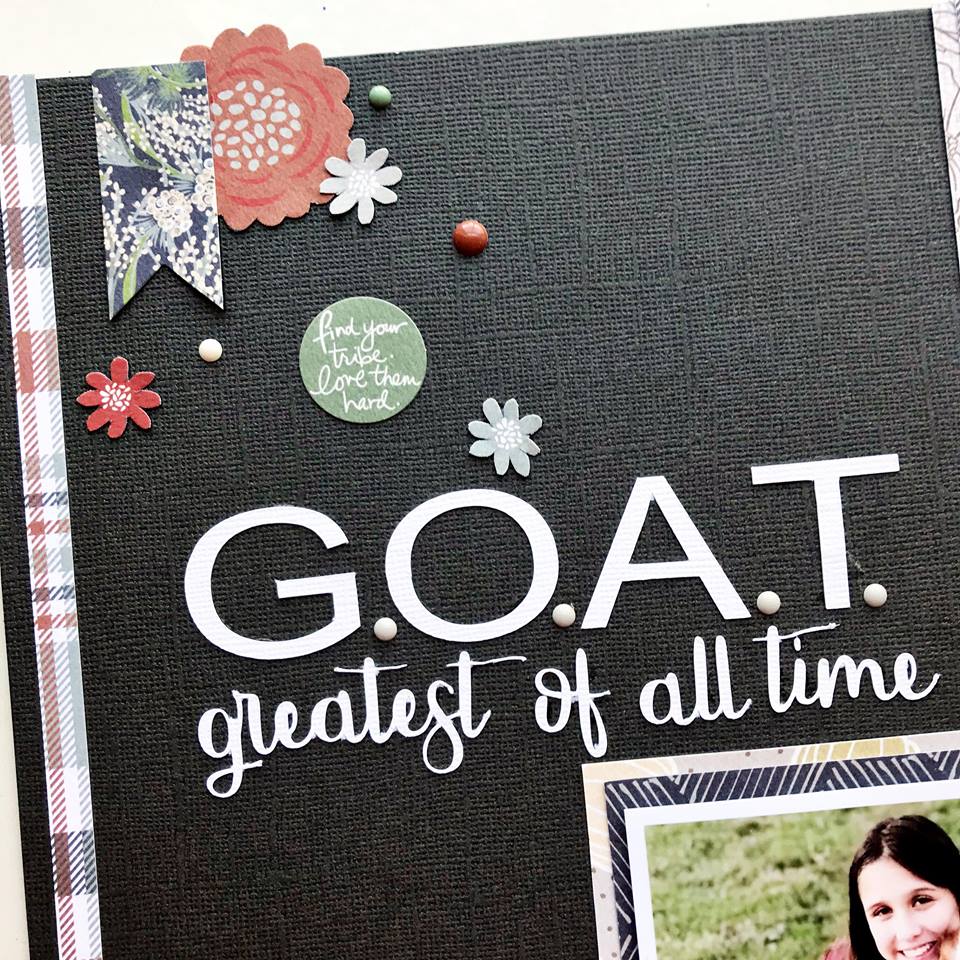
She placed floral clusters around the layout using Ephemera, Enamel Dots, and fussy-cut flowers from papers in the Collection Pack.
She also matted her photo with more paper from the Collection Pack then framed it with more Ephemera, Enamel Dots, and fussy-cut flowers drawing your eye to that adorable photo.
I just love how she used this fall-themed collection for a layout that wasn’t all about fall. It’s always great when you can stretch your products and use them in unexpected ways.
There are more great products in the collection such as Chipboard Words, Washi Tape, Travelers Notebooks, and a 4×6 Stamp Set.
Be sure to check out the Farmhouse Fall collection (plus other great new collections) at the Keep It Simple website. I hope you enjoyed today’s Inspiration Station project. Thanks so much for stopping by!
Love the layouts
Love the look of this layout. It’s simple, and draws your eye right to the focal point which is the picture.
The large plaid mixed with a bit of patterns look so great — will be trying on a layout today.
Mary Beth
Love this layout!
Beautiful use of color.
Beautiful! I love the simplicity of this layout
Look very nice and simple. I think they looks great.
Nicely done,
Cute layout!!
Love that plaid!