Hey everyone! Roree here with today’s Inspiration Station post and I have a beautiful project and some fun products to share with you from our new brand, Keep It Simple.
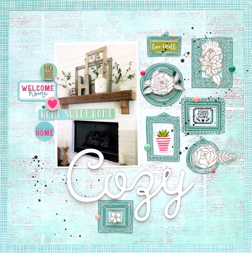
Today, I am sharing the work of Ashley Horton, an amazingly talented designer who worked with the Namaste Home collection . Here is her layout using this fun & colorful line and what she had to say about creating it:

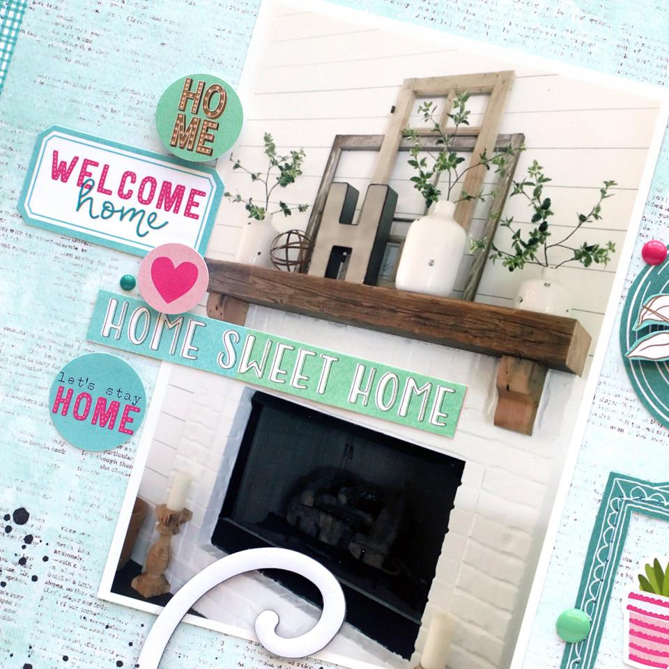
The Namaste Home collection is great for a variety of photos! We recently moved into a new house, and I’ve wanted to document our decor. I really love our fireplace area and wanted to feature my photo on this layout.

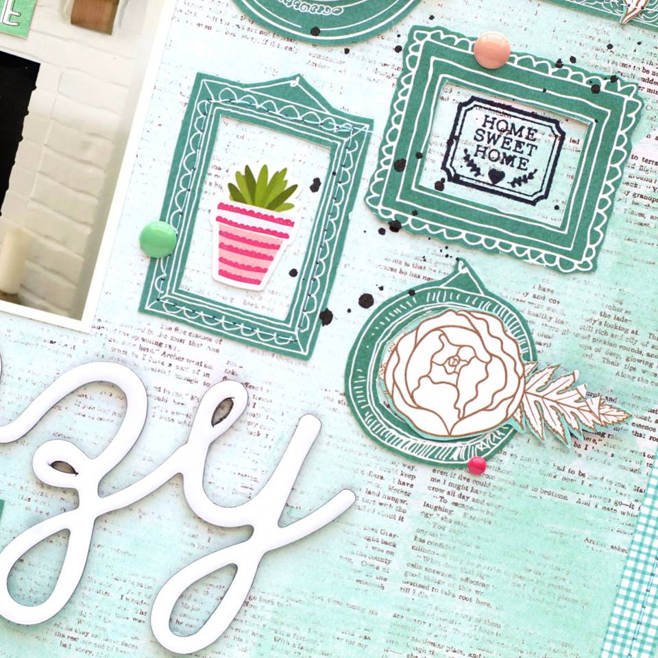
I used a large photo on the layout and balanced it with frames that were fussy cut from one of the patterned papers. I wanted to add some extra texture to the layout, so I machine stitched around a few of the frames.

I also wanted to add dimension, so I used pop dots to raise some of my embellishments off of the page. After finishing the embellishments inside the frames, I created a cluster on the left hand side of my photo, to balance out the design.”
Ashley used papers from the Collection Pack, as well as die cuts from the Ephemera pack and Enamel Dots.
This is a great collection for so many types of projects! And there are more great products in the collection such as Chipboard Words, Washi Tape, Travelers Notebooks, and a 4×6 Stamp Set.
Be sure to check out the Namaste Home collection (plus our other great new collections) at the Keep It Simple website. I hope you enjoyed today’s Inspiration Station project. Thanks so much for stopping by!


This layout is absolutely darling! Great colors, too, something different for house/home themes.
I love everything about this; the colors especially!
Beautiful collection?
Great use of colors and frame work.