Welcome back! Today’s card is very stamped and layered, but still flat enough for mailing. I love the dimension that all of these fun layers bring to the design, yet it’s not too bulky. Let’s get started, and I’ll walk you through my process – it’s easier than it looks!
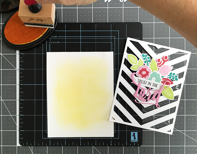
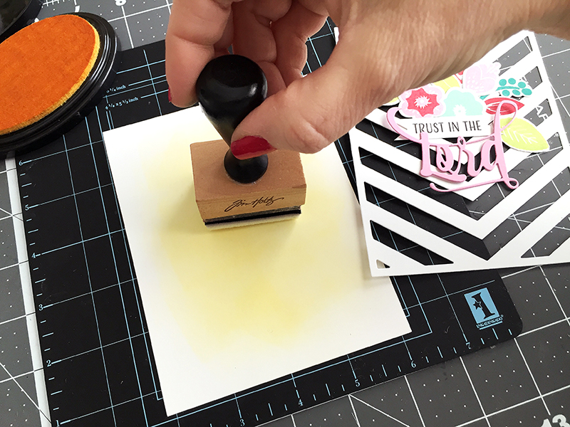
First, I added some ink blending to my white card base. The Tim Holtz ink blender is dipped in Bright Buttercup stamping ink by Papertrey Ink.
Next, I just swirled the ink blender over the card base and kept adding more ink to get the depth of color I wanted.
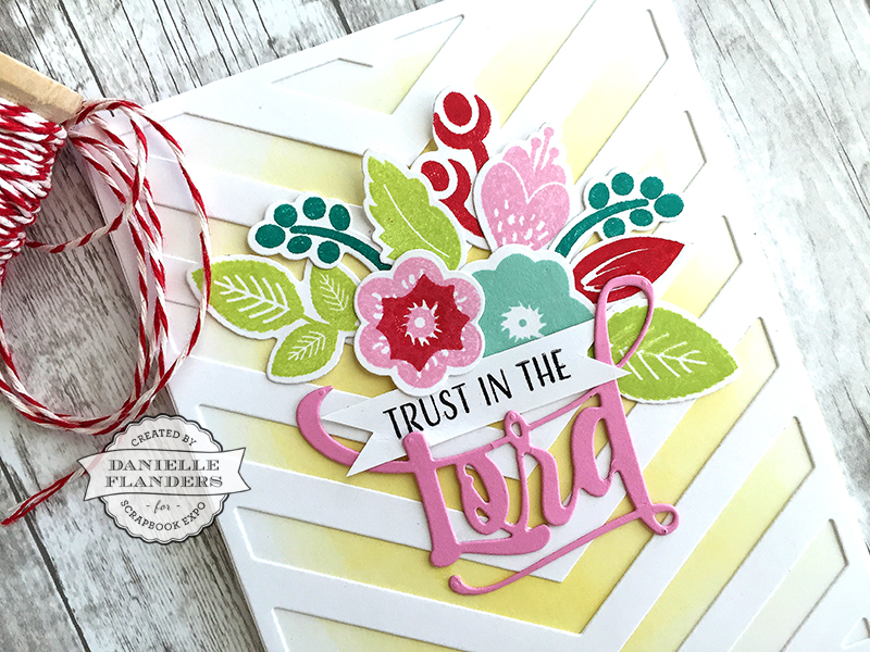
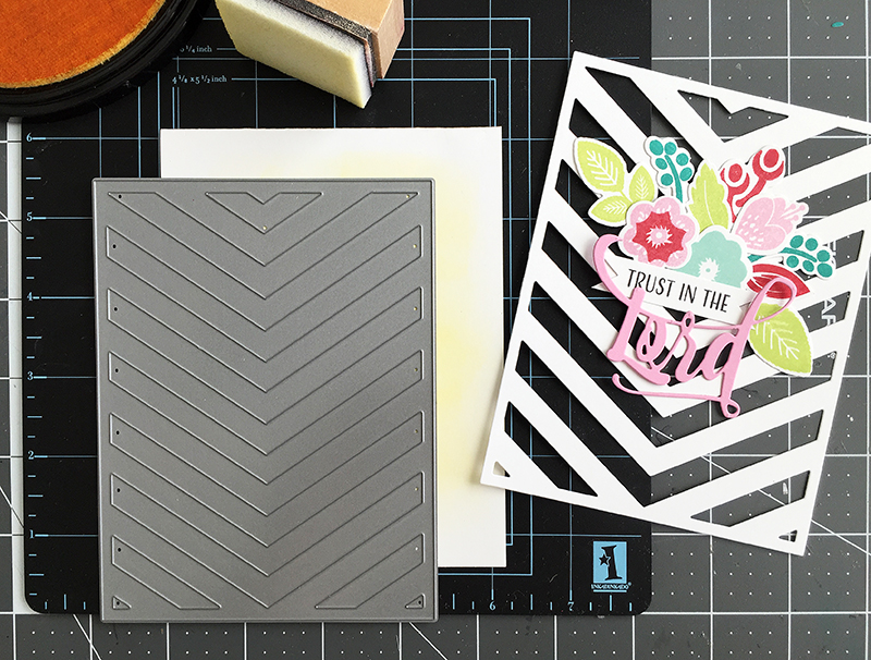
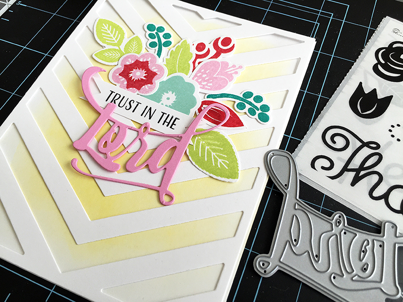
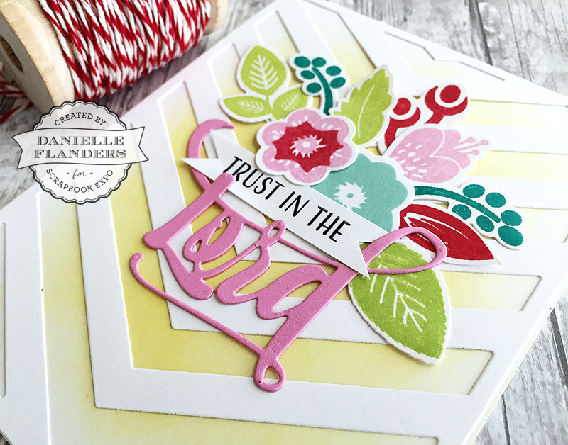
Then another layer was die cut with this Cover Plate: Center Stage die from white cardstock. I’m going to place that over the ink blending to add depth to the design. It’s very layered and adds detail, but still is very flat for mailing.
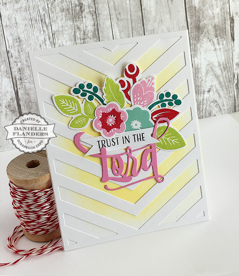
Last, I’ll add some flowers die cut from a new die collection called Bloomin’ Cute and Inspired: Lord. Both of these new stamps and die sets will be released tonight at Papertrey Ink at 10pm EST. I like to die cut them, then stamp them and rearrange them on the card until I get a design that is pleasing to the eye. It’s always nice to have a visual triangle, so I have a triangle of pinks, reds, and greens. You can’t go wrong with using three of each color!
Here are some photos of the finished product!
Let me know if you have any questions about this card; I’d love to hear from you! See you next week!
Danielle

Love how you added the ink on the white card stock base, the dimension it added is wonderful. Wondering why I never thought of doing that, ha ha.