
Happy Tuesday!
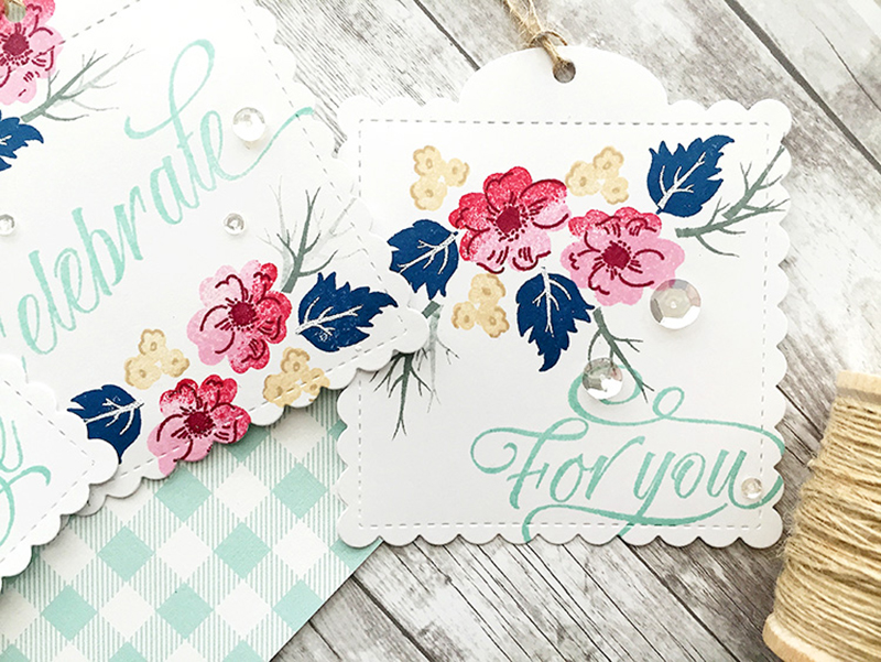
I’m sure you’ve all heard of the ombre look, but have you tried inking up your stamp with two or more colors of ink that are in the same color family to give the stamped image an ombre feel? This gives your stamps much more versatility, as you can give the images a more “realistic” look. For example, on my first set of tags, I have inked up the flowers with first a lighter pink, then the second half of the flower in a darker pink. Before stamping, I dipped the flower into one more ink color, a darker red color just on the edge of the stamp. This gives the flower more shades of color and depth, instead of just a flat, pink flower. Last, the centers of the flowers were stamped in an even darker red. Four shades of pinks/reds were used on these flowers and I love the way they turned out.
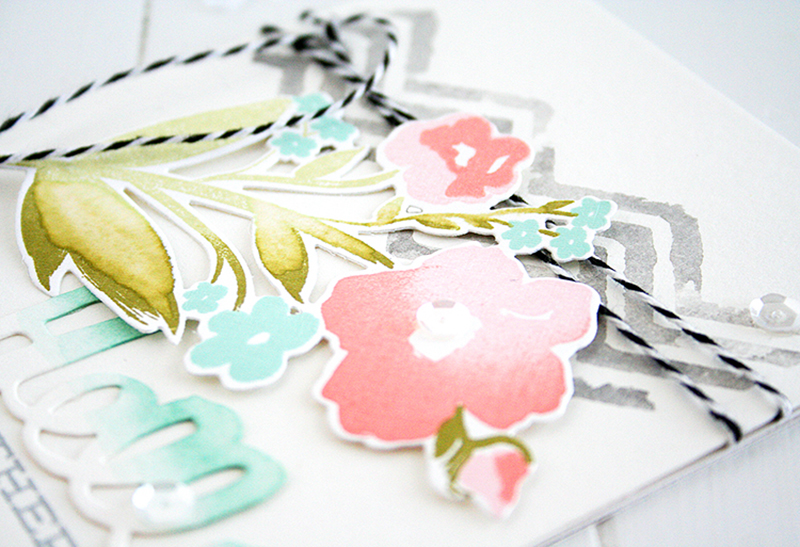
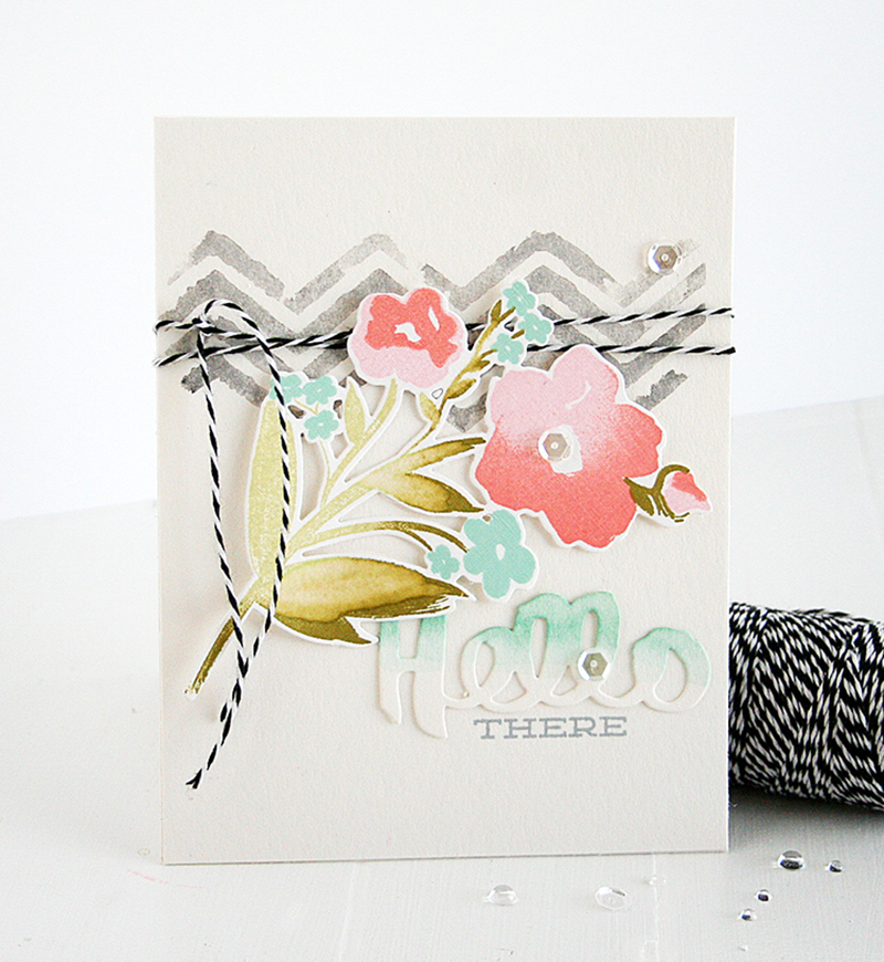
The same technique was done on the large flower below with pink and melon inks and also on the leaves. The only difference on this one is that they are stamped onto watercolor paper, so I used a clean wet paintbrush with a tiny bit of water to blend the inks on the leaves.
And here is one more example of ombre inking that I found online by Melissa Phillips. She used ombre inking on her tulips with yellow and melon inks. I love the look of a multi-colored image! It’s so much nicer than just a flat image, don’t you agree?
Have a creative week! See you back here again soon!
Hi Danielle, I love this technique! It really gives the flowers more dimension and makes them look like you took time hand painting them. Thanks for sharing and always inspiring.
GORGEOUS!!!