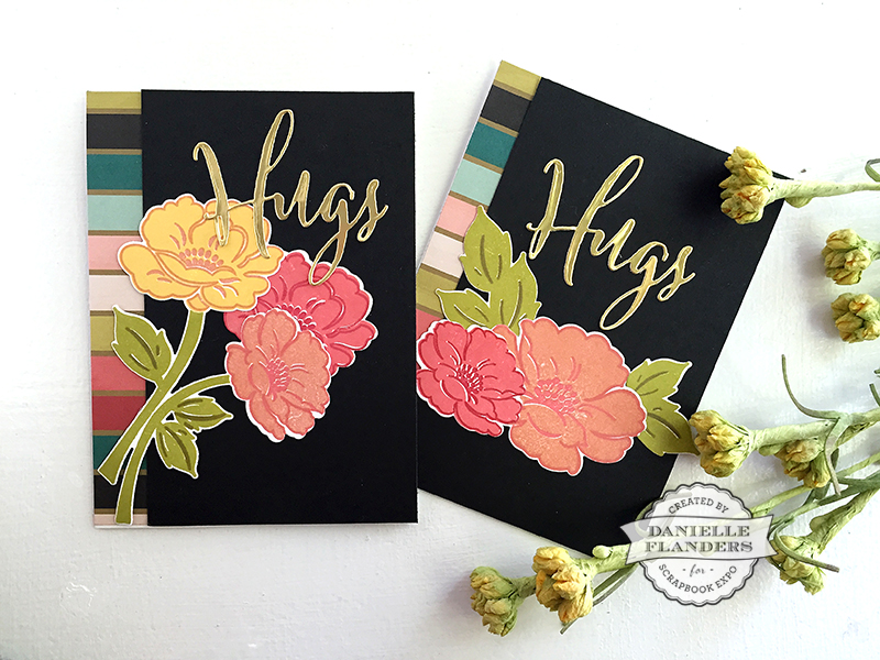
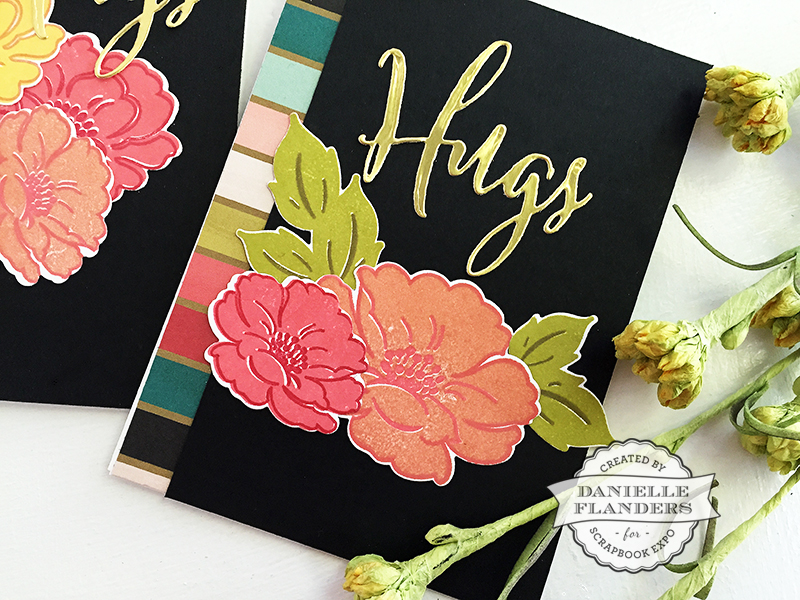
Welcome to another creative card making post! I usually love using white backgrounds on my cards, but with fall arriving here in Colorado, I’ve been in the mood to be different and try some fall colors against a darker background. I love the contrast the darker background gives!
For these cards, I selected a patterned paper that had some autumn colors I wanted to try from the My Mind’s Eye “Market Street” paper pad. I grabbed some True Black cardstock and the Vintage Linens stamps and dies by Papertrey Ink.
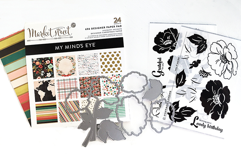
I started by adhering a strip of the patterned paper on the left side of the card. This gives me so many colors to work with! I pulled some of my ink pads to coordinate with the stripes and stamped a few large flowers. I used Melon Berry, Berry Sorbet, Pure Poppy, Simply Chartreuse and Ripe Avocado inks by Papertrey Ink and Butter Bar by Hero Arts.
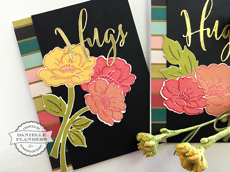
The Hugs dies are cut from Silhouette Gold paper. I simply arranged the flowers and leaves and attached them to the front.
Do you like to add contrast to your cards? Fall is a great time to mix up your colors and try a few new color palettes! For inspiration, try looking for autumn wedding color combinations on Pinterest; there are so many beautiful pictures to inspire you. See you next week!
Danielle
Gorgeous!
Thank you, Linda!
Love this beautiful card with the black background, simply stunning!
Thank you, Melissa!
This is absolutely stunning. What die did you use for the flowers and leaves?
Thank you, Alice. Those are the Vintage Linens dies by PapertreyInk.com.
It’s amazing what a dark background color can do for a card. This work just jumps off the page to showcase it’s beauty.
Love the contrast! So refreshing to see black cardstock being used as the base for a card.
Such beautiful cards and the colors you picked are perfect. I love it when you can make your DSP really do so much of the work for you and then just add stamped images and you have a lovely card, such as yours. Take care and see you next week!