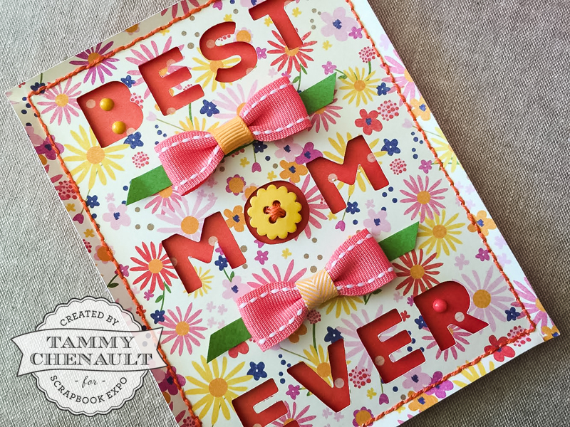
 Hi guys! With Mother’s Day this Sunday, I thought I’d share a pretty, spring-themed Mother’s Day cut file. It’s sized to go on a standard A2 card front, but of course you could easily resize it in your cutting program for a tag, a larger card, or even a piece of framed décor.
Here is the file: Best Mom card
A few notes on color + pattern: Normally with these kind of sentiment cards I cut the negative words from a neutral paper (either a very subdued pattern or totally blank cardstock) and let the letters be the source of color. This time I really wanted to use this medium/large scale floral paper from Pebbles (Lakeside collection, “Wildflowers” sheet) but I knew readability would be an issue with such a pattern. However, I learned a couple tricks along the way to make it work.
1) Go with a single dark-ish solid for your background. I auditioned maaaaany papers for the letters and it was actually pretty tough to find something just right. Anything light-colored just did not work; you couldn’t read the words. Green and dark blue/violet gave the right amount of contrast to the floral paper, they just didn’t look very Mother’s Day to me. I thought about making each word it’s own color, but with such a busy pattern in front, it worked best to stick with the same background for each word. In the end, I actually ended up using the back of the floral pattern! The shade of orange-red was perfect, and the polka dots were small enough to leave the text readable.
2) Pop up your card front. Using foam pop dots between the negative cut outs and the background paper creates a bigger shadow that helps the letters be more readable here.
3) Use embellishments to clarify letter shapes. The “B” on this font happened to hit the paper at a spot where the pattern kind of blended into the background paper. Adding enamel dots where the holes would be helped define the “B” so it didn’t look like a “D”. And of course, “O”s are always a great place to add a fun embellishment like a button, badge, heart, gem, flower, etc.
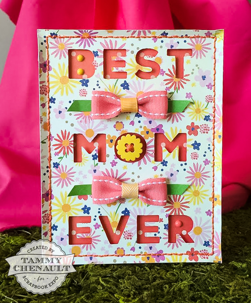
For the bows, I folded 5/8″ pink grosgrain ribbon over on itself, hiding the ends at the back, and glued a skinnier orange ribbon around the middle. The “leaves” are strips of green paper. You need kind of a long skinny embellishment to go in here; something round like a flower pulls the focus too strongly down the middle. Bows work great, or you could do a trio of something small in those spaces. It just has to stand out against the pattern.
If you make a card for Mom, we’d love to see! Share your creations with us in the comments, on our Facebook page, or share it on our Flickr group. Thanks for stopping by and I’ll see you next week!
LOVED THE CARD!!! WISH I COULD COME UP WITH SOME CUTE IDEAS LIKE THAT!!IT SEEMS ALL I EVER TRY TO DO IS COPY SOMEONE’S CUTE IDEA AND IT STILL DOESN’T LOOK THAT GOOD:(
Totally adorable card! So glad I clicked in. What cutting system did you use?
could you go into details on how you cut the words?
Sarita & Kathy – I designed the card in the Silhouette design software and cut it using my Silhouette. After that, I just mounted the cut piece on patterned paper to get the colored letters. Maybe for the next post I will take a few extra shots of the process!
Beth – Hey, imitation is a great starting point in the process! It can help you figure out what you like and don’t like until you feel comfortable with your own style. But don’t be too hard on yourself. I think it’s all too easy to spot the flaws in your own work, but to another pair of eyes, you’ve made something beautiful.
I did that same thing for a long time and when you use different paper and different dies, etc. they begin to come out looking totally differnt and then you get the incentive to try something different and before long you are making something intirely different that what everybody else makes. Keep with it.
Mstgane
Ann